 ---
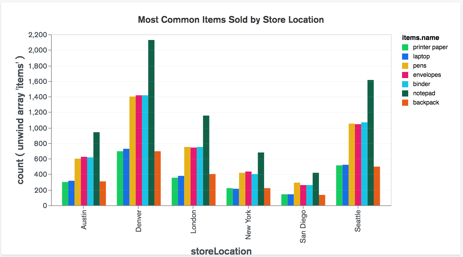
## When to Use a Bar Chart
Bar charts are one of the most simple and frequently used chart types. They are useful for illustrating either one string or one numeric variable, quickly comparing information, or for show exact values.
When thinking about using a bar chart consider:
- Will you use vertical or horizontal bars?
- How will you number your axis (it is always best to start at zero)?
- How will you order your bars?
---
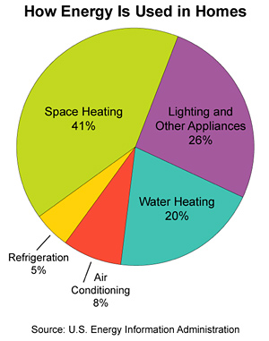
## The Pie Chart in Action
As you can see from this example pie charts can be effective for proportions or percentages.
---
## When to Use the Pie Chart Type
Pie charts are commonly misused. They show a part-to-whole relationship when the total amount is one of your variable and you'd like to show the subdivision of variables.
When thinking about using a pie chart consider:
- The more variables you have, as in the more slices of your pie you'll have, the harder it is to read.
- Area is _very_ difficult for the eye to read, so if any of your wedges are similarly sized think about a different chart type.
- If you want to compare data, leave it to bars or stacked bars. If your viewer has to work to translate pie wedges into relevant data or compare pie charts to one another, the key points you're trying to convey might go unnoticed.
---
## The Scatter Plot in Action
This scatter plot uses a combination of text, coloring, and labelling to describe the data. What is clear or unclear from this chart about the data set?
---
## When to Use a Bar Chart
Bar charts are one of the most simple and frequently used chart types. They are useful for illustrating either one string or one numeric variable, quickly comparing information, or for show exact values.
When thinking about using a bar chart consider:
- Will you use vertical or horizontal bars?
- How will you number your axis (it is always best to start at zero)?
- How will you order your bars?
---
## The Pie Chart in Action
As you can see from this example pie charts can be effective for proportions or percentages.

---
## When to Use the Pie Chart Type
Pie charts are commonly misused. They show a part-to-whole relationship when the total amount is one of your variable and you'd like to show the subdivision of variables.
When thinking about using a pie chart consider:
- The more variables you have, as in the more slices of your pie you'll have, the harder it is to read.
- Area is _very_ difficult for the eye to read, so if any of your wedges are similarly sized think about a different chart type.
- If you want to compare data, leave it to bars or stacked bars. If your viewer has to work to translate pie wedges into relevant data or compare pie charts to one another, the key points you're trying to convey might go unnoticed.
---
## The Scatter Plot in Action
This scatter plot uses a combination of text, coloring, and labelling to describe the data. What is clear or unclear from this chart about the data set?
 What is the midline doing here? How about the legend?
---
## When to Use a Scatter Plot
Scatterplots are great for data dense visualizations and clusters. They are most effective for trends, concentrations, and outliers. They can be especially useful to see what you want to investigate further.
When thinking about using a scatter plot consider:
- If dots are covering up each other, consider a different chart type.
- A bubble chart is one variation on the scatter plot.
---
## Knowledge Check: Choosing a Chart
Annual sales in each state for a grocery store chain?
- Bar chart.
- Pie chart.
- Scatterplot.
---
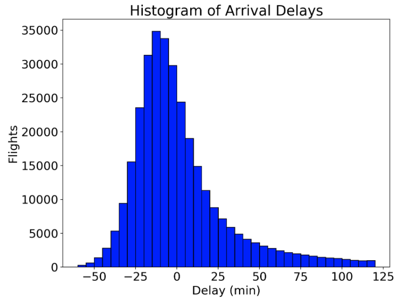
## When to Use a Histogram
- Effective for showing the distribution of a numerical value.
---
## Bar Chart vs Histogram
The main difference between a bar chart and histogram is that histograms are used to show distributions of variables while bar charts are used to _compare_ variables.
- Histograms look similar to bar charts, but with bar charts, each column represents a group defined by a categorical variable; and with histograms, each column represents a group defined by a continuous, quantitative variable.
- One implication of this distinction: with a histogram, it can be appropriate to talk about the the tendency of the observations to fall more on the low end or the high end of the X axis.
- With bar charts, however, the X axis does not have a low end or a high end; because the labels on the X axis are categorical - not quantitative.

---
## Which type of chart?
Relationship of average income to education level?
- Bar chart.
- Pie chart.
- Scatterplot.
- Histogram.
---
## A Line Chart in Action
Line graphs are an excellent way to show change over time. While bar charts can also show time, they don't show it in a continuous way like a line chart.
---
## When to Use a Line Chart
Line charts are particularly good at showing how a variable changes over time. They work best if you have one date variable and one number variable.
When thinking about using a line chart consider:
- How many lines you'll need on your graph, the more overlapping lines there are, the harder your chart will be to read.
- Consider how many colors you need to use for your lines. Giving each line its own color forces the viewer to scan back and forth from the key to the graph.
- Individual data points can be hard to read, but line charts are good for showing overall trends.
- Similar to bar charts, try and start at 0 on your y axis.
---
## Knowledge Check: Which type of chart?
Change in average income since 1960 for American adults?
- Bar chart.
- Pie chart.
- Scatterplot.
- Line chart.
- Histogram.
---
## Returning to How to Choose the Right Chart
Check out [this series of charts](https://i.redd.it/e7alp8yrnb711.png): `https://i.redd.it/e7alp8yrnb711.png`
- Which is easiest to view the data?
What is the midline doing here? How about the legend?
---
## When to Use a Scatter Plot
Scatterplots are great for data dense visualizations and clusters. They are most effective for trends, concentrations, and outliers. They can be especially useful to see what you want to investigate further.
When thinking about using a scatter plot consider:
- If dots are covering up each other, consider a different chart type.
- A bubble chart is one variation on the scatter plot.
---
## Knowledge Check: Choosing a Chart
Annual sales in each state for a grocery store chain?
- Bar chart.
- Pie chart.
- Scatterplot.
---
## When to Use a Histogram
- Effective for showing the distribution of a numerical value.

---
## Bar Chart vs Histogram
The main difference between a bar chart and histogram is that histograms are used to show distributions of variables while bar charts are used to _compare_ variables.
- Histograms look similar to bar charts, but with bar charts, each column represents a group defined by a categorical variable; and with histograms, each column represents a group defined by a continuous, quantitative variable.
- One implication of this distinction: with a histogram, it can be appropriate to talk about the the tendency of the observations to fall more on the low end or the high end of the X axis.
- With bar charts, however, the X axis does not have a low end or a high end; because the labels on the X axis are categorical - not quantitative.

---
## Which type of chart?
Relationship of average income to education level?
- Bar chart.
- Pie chart.
- Scatterplot.
- Histogram.
---
## A Line Chart in Action
Line graphs are an excellent way to show change over time. While bar charts can also show time, they don't show it in a continuous way like a line chart.

---
## When to Use a Line Chart
Line charts are particularly good at showing how a variable changes over time. They work best if you have one date variable and one number variable.
When thinking about using a line chart consider:
- How many lines you'll need on your graph, the more overlapping lines there are, the harder your chart will be to read.
- Consider how many colors you need to use for your lines. Giving each line its own color forces the viewer to scan back and forth from the key to the graph.
- Individual data points can be hard to read, but line charts are good for showing overall trends.
- Similar to bar charts, try and start at 0 on your y axis.
---
## Knowledge Check: Which type of chart?
Change in average income since 1960 for American adults?
- Bar chart.
- Pie chart.
- Scatterplot.
- Line chart.
- Histogram.
---
## Returning to How to Choose the Right Chart
Check out [this series of charts](https://i.redd.it/e7alp8yrnb711.png): `https://i.redd.it/e7alp8yrnb711.png`
- Which is easiest to view the data?
It's subjective! There are pros and cons to each. Choosing a chart type depends firstly on the data you have. Secondly, it depends on the clearest way to convey your message. The alignment of these two aspects will help you decide what type of visualization to use.
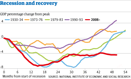
--- ## Charts & Code There is an increasing array of libraries and tools to allow us to use code to create visualize data in compelling and approachable ways. Check out this complex chart that was made using Python! *Source: u/dx034 on Reddit*
---
## Activity: Exploring Good Visualizations
Go to [https://www.reddit.com/r/dataisbeautiful/top/](https://www.reddit.com/r/dataisbeautiful/top/). These are all data visualizations created by people like you!
Explore some of the visualizations. What do you like or not like about some of the visualizations? Why? Was it easy to understand the story being told by the visualization? Think about this when making your own data visualizations.
---
## Visual Attributes of Good Data Visualization
Some attributes affect our brain more strongly.
In order of focus:
- Position
- Color
- Size
---
## Summary
- The chart type you select should accurately represent the variables you are pulling from data in a way that is clearly readable for your audience.
- Visual considerations include: position, color, order, size. What else?
- With data visualizations becoming increasingly popular, a clean and clear chart goes a long way in conveying a message from a data set.
---
## Additional Resources
- A great short article on [when pie charts are better?](http://annkemery.com/pie-chart-guidelines/)
- [A gallery of charts](https://github.com/mbostock/d3/wiki/Gallery)
- [A Stats Video](https://www.youtube.com/watch?v=hVimVzgtD6w)
- [SAS: Data Viz](http://www.sas.com/en_us/insights/big-data/data-visualization.html)
- [A guide to when to use each chart](https://drive.google.com/file/d/0Bx2SHQGVqWasT1l4NWtLclJJcWM/view)
- [44 Types of Graphs](http://blog.visme.co/types-of-graphs/)
- [Advice on making good visualizations](https://www.gooddata.com/blog/8-ways-turn-good-data-great-visualizations)
- [Reddit's Data Visualization forum](http://reddit.com/r/dataisbeautiful)
*Source: u/dx034 on Reddit*
---
## Activity: Exploring Good Visualizations
Go to [https://www.reddit.com/r/dataisbeautiful/top/](https://www.reddit.com/r/dataisbeautiful/top/). These are all data visualizations created by people like you!
Explore some of the visualizations. What do you like or not like about some of the visualizations? Why? Was it easy to understand the story being told by the visualization? Think about this when making your own data visualizations.
---
## Visual Attributes of Good Data Visualization
Some attributes affect our brain more strongly.
In order of focus:
- Position
- Color
- Size
---
## Summary
- The chart type you select should accurately represent the variables you are pulling from data in a way that is clearly readable for your audience.
- Visual considerations include: position, color, order, size. What else?
- With data visualizations becoming increasingly popular, a clean and clear chart goes a long way in conveying a message from a data set.
---
## Additional Resources
- A great short article on [when pie charts are better?](http://annkemery.com/pie-chart-guidelines/)
- [A gallery of charts](https://github.com/mbostock/d3/wiki/Gallery)
- [A Stats Video](https://www.youtube.com/watch?v=hVimVzgtD6w)
- [SAS: Data Viz](http://www.sas.com/en_us/insights/big-data/data-visualization.html)
- [A guide to when to use each chart](https://drive.google.com/file/d/0Bx2SHQGVqWasT1l4NWtLclJJcWM/view)
- [44 Types of Graphs](http://blog.visme.co/types-of-graphs/)
- [Advice on making good visualizations](https://www.gooddata.com/blog/8-ways-turn-good-data-great-visualizations)
- [Reddit's Data Visualization forum](http://reddit.com/r/dataisbeautiful)