You can not select more than 25 topics
Topics must start with a letter or number, can include dashes ('-') and can be up to 35 characters long.
104 lines
4.6 KiB
104 lines
4.6 KiB
# CSS - Flex boxes and Viewport CSS
|
|
|
|
## Lesson Objectives
|
|
|
|
1. Describe viewport units
|
|
1. Describe flex boxes and why they're great
|
|
1. Diagram the flex box module
|
|
1. List the properties of the flex container
|
|
1. List the properties of the flex items
|
|
|
|
## Describe viewport units
|
|
|
|
### Definition
|
|
|
|
This is a unit of measure, like px, %, em, etc
|
|
- 1vw = 1% of window width
|
|
- 1vh = 1% of window height
|
|
- 1vmin = 1% of whichever dimension (width or height) is smaller
|
|
- 1vmax = 1% of whichever dimension (width or height) is lager
|
|
|
|
### Practical Applications
|
|
|
|
1. resize your window width
|
|
- you'll notice the text doesn't resize, responsively
|
|
- the issue is that text might be too big for small height screens
|
|
- can have font-size change with width of screen (or any other dimension)
|
|
1. imagine you have a scrolling page filled with cards
|
|
- cards should fill the screen
|
|
1. div that must maintain same W x H ratio for any screen width
|
|
- a chess board
|
|
|
|
## Describe flex boxes and why they're great
|
|
|
|
Up until now, CSS has been more difficult than it should be for certain tasks (vertical alignment, three column layout). Flex boxes let you do these basic things easily. It also makes fluid layout much easier.
|
|
|
|
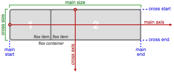
## Diagram the flex box module
|
|
|
|
|
|
|
|
[source](https://css-tricks.com/snippets/css/a-guide-to-flexbox/)
|
|
|
|
## Properties of the flex container
|
|
1. display: (flex | inline-flex);
|
|
- flex: block level element
|
|
- inline-flex: inline element
|
|
1. flex-direction: (row | row-reverse | column | column-reverse);
|
|
- row: normal layout (left to right)
|
|
- row-reverse: reverse direction (right to left)
|
|
- column: vertically (up to down)
|
|
- column-reverse: reverse vertical (down to up)
|
|
1. justify-content: (flex-start | flex-end | center | space-between | space-around);
|
|
- Horizontally aligns the flex items when the items do not use all available space on the main-axis
|
|
- values
|
|
- flex-start: start of main axis
|
|
- flex-end: end of main axis
|
|
- center: center of main axis
|
|
- space-between: evenly space, with extra space distributed **between** elements
|
|
- space-around: evenly space, with extra space distributed **around** elements
|
|
1. align-items: (flex-start | flex-end | center | baseline | stretch);
|
|
- Like justify-content, but for cross axis
|
|
- values
|
|
- flex-start: start of cross axis
|
|
- flex-end: end of cross axis
|
|
- center: center of cross axis
|
|
- baseline: align items, such that their baselines match
|
|
- stretch: stretch items to fill cross axis
|
|
1. flex-wrap: nowrap | wrap | wrap-reverse;
|
|
- By default, flex items will all try to fit onto one line along main axis. You can change that and allow the items to wrap as needed with this property.
|
|
- values
|
|
- nowrap: don't wrap
|
|
- wrap: make elements wrap if there is not enough space
|
|
- wrap-reverse: wrap, but rows are reversed
|
|
1. align-content: (flex-start | flex-end | center | space-between | space-around | stretch);
|
|
- When there are multiple rows of content, space rows in the same way as justify-content
|
|
- values
|
|
- flex-start: start of main axis
|
|
- flex-end: end of main axis
|
|
- flex-center: center of main axis
|
|
- space-between: evenly space, with extra space distributed **between** elements
|
|
- space-around: evenly space, with extra space distributed **around** elements
|
|
|
|
## List the properties of the flex items
|
|
1. order: <integer>;
|
|
- can specify order of elements
|
|
- higher numbers come last
|
|
1. flex-grow: <number>;
|
|
- This defines the ability for a flex item to grow if necessary. It accepts a unitless value that serves as a proportion. It dictates what amount of the available space inside the flex container the item should take up.
|
|
- If all items have flex-grow set to 1, the remaining space in the container will be distributed equally to all children. If one of the children a value of 2, the remaining space would take up twice as much space as the others (or it will try to, at least).
|
|
1. flex-basis: <length> | auto;
|
|
- can specify the width of an element before it is resized use flex-grow/shrink
|
|
- if all elements have flex-basis set to 0 and flex-grow set to the same value, all elements will be the same width
|
|
1. flex-shrink: <number>;
|
|
- defines the ability of an item to shrink
|
|
- 0 means it won't shrink
|
|
- is a proportion of how much it will shrink in relation to other elements
|
|
1. align-self: (auto | flex-start | flex-end | center | baseline | stretch);
|
|
- This allows the alignment specified by align-items to be overridden for individual flex items.
|
|
- values
|
|
- flex-start: start of cross axis
|
|
- flex-end: end of cross axis
|
|
- center: center of cross axis
|
|
- baseline: align items, such that their baselines match
|
|
- stretch: stretch items to fill cross axis
|