5.4 KiB
CSS GRID
Lesson Objectives
- What is CSS Grid?
- Basic Terminology
- Grid Container
- Placing Grid Lines
- Grid Areas
- Attaching Elements to the Grid
- Grid Item Overlap
- Grid Spaces
- Alignment
- Resources
What is CSS Grid
CSS grid is a generalized layout system with its emphasis on rows and columns.
Basic Terminology
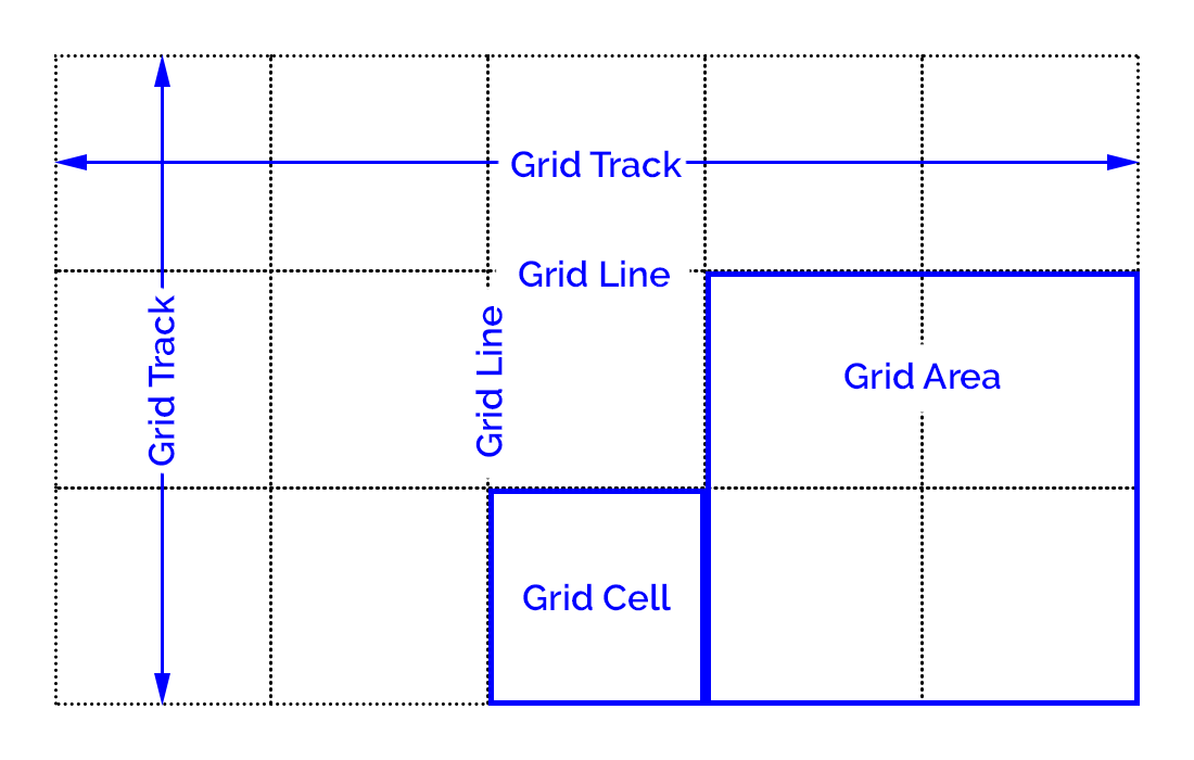
Grid container - An element that defines a grid-formatting context for its contents.
Grid item - A thing that participates in grid layout within a grid-formatting context.
Grid track - A continuous run between two adjacent grid lines. A grid row or column.
Grid cell - Any space bounded by four grid lines, with no grid lines running through it.
Grid area - Any rectangular area bounded by four grid lines and made up of one or more grid cells.
Grid Container
index.html
<div class="container">
  <div id="item1" class=""> <p>Item 1</p> </div>
  <div id="item2" class=""> <p>Item 2</p> </div>
  <div id="item3" class=""> <p>Item 3</p> </div>
  <div id="item4" class=""> <p>Item 4</p> </div>
  <div id="item5" class=""> <p>Item 5</p> </div>
  <div id="item6" class=""> <p>Item 6</p> </div>
</div>
main.css
.container {
  display: grid;
}
Placing Grid Lines
Fixed-Width Grid Tracks
.container {
  grid-template-columns: 200px 50% 10em;
  grid-template-rows: 100px 200px;
}
Flexible Grid Tracks
You can divide up the space into fractional units using fr.
grid-template-columns: 1fr 2fr 3fr;
Content-Aware Tracks
You can make the grid cell fit the contents of the grid item using min-content and max-content.
grid-template-columns: 1fr max-content 3fr;
Grid Areas
grid-template-areas:
  "header1 header2 header3"
  "content1 content2 content3"
  "footer1 footer2 footer3";
Attaching Elements to the Grid
Using Grid Lines
#item3 {
  grid-column-start: 1;
  grid-column-end: 2;
  grid-row-start: 1;
  grid-row-end: 2;
}
#item3 {
  grid-column-start: 1;
  grid-column-end: span;
}
Using Named Grid Lines
.container {
  grid-template-columns: [one] 1fr [two] 3fr [biff] 2fr [stop-me];
}

#item3 {
  grid-column-start: one;
  grid-column-end: biff;
}
Short hand
#item3 {
  grid-column: one / biff;
  grid-row: 1 / 3;
}
Using Areas
#item1 {
  grid-area: footer2;
}

#item2 {
  grid-area: header3;
}

#item5 {
  grid-area: header1;
}
An item can cover more than one area using multiple areas.
#item5 {
  grid-area: header1 / header1 / content1 / header2;
}
You can set an area to cover more than one grid cell.
grid-template-areas:
  "header1 header1 header3"
  "content1 content2 content3"
  "footer1 footer2 footer3";

#item5 {
  grid-area: header1;
}
.container {
  grid-template-areas:
    "header1 header1 header3"
    "content1 content2 rightside"
    "footer1 footer2 rightside";
}

#item3 {
  grid-area: rightside;
}
Grid Item Overlap
#item5 {
  grid-area: header1 / header1 / content1 / header3;
}
You can use z-index to order overlapping grid items. Elements with a higher z-index will be placed on top of elements with lower z-index values.
#item2 {
  grid-area: header3;
  z-index: 2;
}

#item3 {
  grid-area: rightside;
  z-index: 2;
}

#item5 {
  grid-area: header1 / header1 / content1 / header3;
  z-index: 0;
}
Grid Spaces
A gutter, or gap, is the space between two grid tracks. You can set the gutter size in the grid container.
.container {
  grid-row-gap: 20px;
  grid-column-gap: 5em;
  grid-gap: 10px;
}
Alignment
Grid items can be aligned both horizontally and vertically. Horizontal alignment is done with the justify-* properties and vertically with the align-* properties.
Aligning a Grid Item
justify-self: [ start | left | center | end | right | stretch ]
align-self: [ start | left | center | end | right | stretch ]
#item1 {
  justify-self: start;
  align-self: end;
}

#item2 {
  justify-self: center;
  align-self: center;
}

#item4 {
  justify-self: stretch;
  align-self: stretch;
}
Aligning All Items
justify-items: [ start | left | center | end | right | stretch ]
align-items: [ start | left | center | end | right | stretch ]
.container {
  justify-items: center;
  align-items: end;
}
Aligning the Entire Grid
You can justify or align the entire grid. This may override any gap values you've set.
justify-content: [ start | left | center | end | right | space-between | space-around | space-evenly ]
align-content: [ start | left | center | end | right | space-between | space-around | space-evenly ]
.container {
  grid-template-columns: 100px 300px 200px;
  justify-content: center;

  grid-template-rows: 120px 40px 60px;
  min-height: 400px;
  align-content: center;
}
Resources
CSS-TRICKS A Complete Guide to Grid
Grid Garden (A game for learning grid)
CSS Grid Changes EVERYTHING (YouTube)
"Grid Layout in CSS: Interface Layout for the Web" by Eric A. Meyer